The theme for this quarter's piece was Colour Theory, and what a massive and complicated subject that is!
Essentially it's about describing and explaining relationships between colours and why we find some satisfying. As quilt makers most of us have probably come across the 'Colour Wheel' at some point - we often use it as reference when considering which colours might go well together. The particular wheel we are familiar with - the subtractive colour wheel, which is based on mixing pigments, and uses the primary colours red, yellow and blue - only represents one way of describing the relationships between different colours. There are other models which depend, for example, on whether you are considering the properties of light - the additive colour wheel - or the physiology of the human eye.
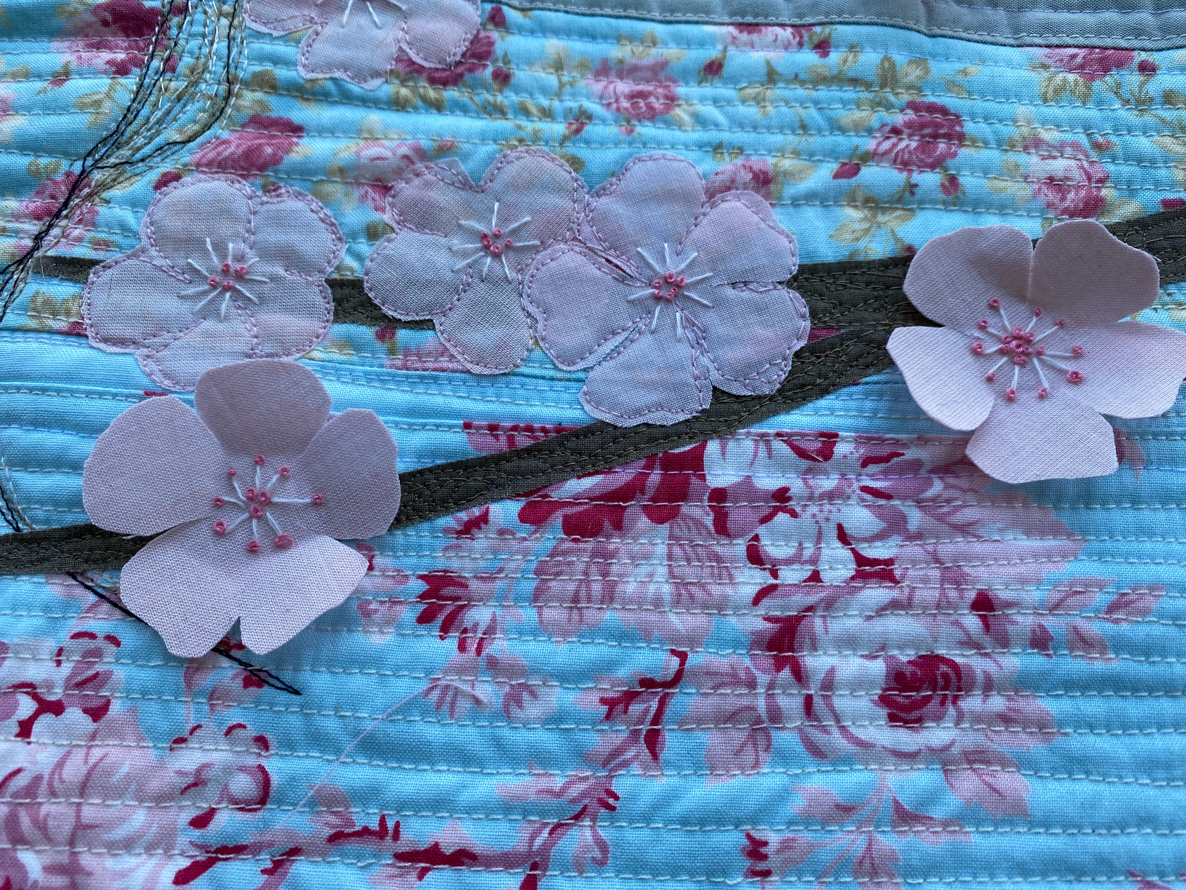
As I was feeling my way round the enormity of the subject, and at a bit at a loss, I thought about making an abstract quilt using complementary colours. However I couldn't get away from a picture in my head of pink blossom against sunny blue skies and I really wanted to make that quilt even before I'd considered what the relationship between the colours was.
The Spirit of Summer

For me, this is a really exciting combination of colours. If you look at my
blog you will see another quilt in my header which uses it.
Using the quilters' subtractive colour wheel, red, of which pink is a tint, and this green-blue are split complementary colours (Interesting that unlike most tints, pink is significant enough to have its own name, instead of being 'pale red'.) Green is red's complement, the colour with the highest contrast - and blue-green is an analogous colour to blue, which makes it part of a split complementary colour scheme with red.
Using the additive colour wheel, the blue here is close to Cyan, which is directly opposite red, and is its complement. If we think about how the human eye works, red and cyan stimulate different photoreceptors and together they are visually exciting.
So this quilt doesn't address the theme of Colour Theory head on but it illustrates two colours which have a particularly strong relationship with each other. We don't have to know why we find a particular colour combination appealing [
edited to add and Ruth's
post made me realise that the emotional and thematic effect of these two colours is what is important to me] but Colour Theory can help us to explain and describe colour relationships we like and to put other combinations together.


The flowers are gorgeous and the sketch stiched portrait is a great focal point for your quilt. This feels so thoughtful and serene and something really lovely to look at up on the wall.
ReplyDeleteThanks Ruth. Your post really made me think more about the way that colour theory is useful for describing relationships between colours but that the feelings and images colour combinations suggest is really the thing, as you can see from all our different quilts!
ReplyDeleteCatherine, I could spot a quilt made by you a mile away. This is lovely. Lovely means "exquisitely beautiful" I just learned. The wavy quilting that is so dear to my heart, the colors, the blossoms. (Strange that I was just thinking yesterday that red and white make pink but other colors are mostly labeled "light" something.) The song Windmills of my Mind comes to mind as I view the woman with the waves and blossoms within and well as without. Just lovely.
ReplyDeleteAns I also didn't know of the Subtractive Color Wheel. Cool.
DeleteI like it. Great interpretation of the challenge.
ReplyDeleteBeautiful details in your quilt. I love what you’ve done here. So delicate and pretty.
ReplyDeleteThis is such a lovely quilt. I like the way you have used the wavy quilting lines to merge the background pieces and created dimension with the flowers and your stitched figure is beautiful. It reminds me of early Summer when the sky is so blue and the air is so alive with the scent of apple blossom that the world seems so full of colour and fragrance you feel hardly there at all...
ReplyDeleteMy immediate thought when I saw your quilt was how much I liked the color combination, and how clever the use of the 3D flowers. Then I saw the quilting and that brought more delight. I learned so much from this post, too. Really nice capture of the theme.
ReplyDeleteCatherine your quilts always have so much thought behind them that I have to read your posts twice to really appreciate them and this one was no different. I didn't even see the quilted portrait the first time I looked at your photo! You always use such calming colour palettes that like Maureen, I think your signature style shines through in every Challenge quilt you create.
ReplyDeleteI like how you chose a personal palette for this challenge, and I love the details of the little blossoms.
ReplyDelete