Tuesday 4 May 2021

New Theme Announcement

That was another fantastic reveal, and as usual it was just really exciting to see the different approaches we all took to the theme and the different 'threads' we pulled from it!

Now on to the next one.  Our remaining themes are:

1. A quilt inspired by a newspaper headline

2. Emotions/feelings

3. Opposites attract

From these, Mr Random has chosen


So our next theme, with the reveal of our pieces on 1 August, is 'Opposites Attract'.

Catherine :-)

Saturday 1 May 2021

Color Wheel Challenge

 While it took me some time to figure out what I wanted to do for this challenge, in the end I thoroughly enjoyed the process. After thinking about color theory and how colors relate to each other, I decided to narrow it down and play with four analagous colors. I happened to have an analagous fat quarter bundle in my stash, which felt a bit like cheating, but I really wanted to play with those fabrics. 


The fabric bundle came from Cherrywood Fabrics. Their fabrics are hand dyed and the colors are so rich. It is really quite fun to play with them. 

I play intuitively with color when I'm not working with a curated bundle. I just choose whatever I think goes well together. Thinking of intuitive reminded me of Jean Wells' book Intuitive Quilting and Design and brought to mind a project from that book that I wanted to try. 

First things first, I needed to do a little improv play, so I got busy slicing up those analagous fabrics. 


Typical of me, I got so absorbed in playing, I only took one photo. Please ignore the fussy background (my pressing table fabric). Once I had my improv pieces done, this came into play: 


That's a 9-inch stretched canvas, 3" deep. I had three of them, so I got to work. This was such a different approach to finishing small quilts and a unique way to display them. 


Okay, I'll quit teasing. Here are my finished challenge pieces. 


I have this space above the patio door in my quilt room, which is the first thing I see when I enter the room. I've wanted something in that space, and this trio brighten it up and make me smile whenever I see them. 


It was difficult to get a decent photo, but I hope you get the idea. It's really a very bright room, not dark as the photo implies. 

I hope this meets the challenge and that I haven't stepped outside of the purpose of these challenges. I'm looking forward to seeing what everyone else made for this challenge! 

Wendy

Color Theory: Flights of Fancy

Color Theory was a rather broad topic, and I went all different directions with it. I searched for inspiration on Pinterest, and something triggered a memory of a mixed flight of finches we kept some many years ago. This was pre-digital camera days, and so I didn't have any pictures of our birds. However, I was able to find all the images I needed on Creative Commons, where images are available for use free of charge with proper attribution. Any images used from the site have been attributed to the original photographer in keeping with the requirements of Creative Commons. 

Our flight included a pair of Owl finches. They have the sweetest owl-like faces. 

Image source: "Owl Finch" by guppiecat is licensed with CC BY-NC-ND 2.0. To view a copy of this license, visit https://creativecommons.org/licenses/by-nc-nd/2.0/

Also in our flight were a pair of Strawberry finches. They have the most beautiful song.

Image credit: "A Strawberry Finch in the evening's golden light" by Hari K Patibanda is licensed with CC BY 2.0. To view a copy of this license, visit https://creativecommons.org/licenses/by/2.0/

For purposes of this challenge, however, I wanted to talk about the pair of Gouldian Finches we kept in our mixed flight. These are the most beautiful birds. They come in all colors. Our pair consisted of a red-headed male, and a black-headed female.

Image source: "Mareeba. A pair of Gouldian Finches. They are on the endangered list and almost extinct. Mareeba has a breeding program." by denisbin is licensed with CC BY-ND 2.0. To view a copy of this license, visit https://creativecommons.org/licenses/by-nd/2.0/

They were a breeding pair. We often found their little eggs in the bottom of the cage. The eggs were approximately the size of a peanut M&M. Consulting with our friends in the Rose City Exotic Bird Club, it was suggested we provide them with a nesting basket like the one pictured below.

Image source: "Gouldian Finch" by Peter Radunzel is licensed under CC BY-NC-SA 2.0

After several tries, they successfully raised a brood of three chicks. It takes several weeks for the chicks to "color up," and they start with fairly uniform gray feathers. 

Image source: "Lady Gouldian Finch - Baby" by Geek2Nurse is licensed under CC BY-NC 2.0

As they matured, we wondered what colors we would end up with. Surprisingly, they raised a red-headed female. We called her Lucille (after that famous red-head, Lucille Ball).

Image Credit: "Gouldian Finch" by Bernard Spragg is marked under CC0 1.0. To view the terms, visit https://creativecommons.org/licenses/cc0/1.0/

There was also a black-headed male. There was something wrong with his feet, and he couldn't sit on a perch. We called him "Tiny Tim."


Image Credit: "Gouldian Finch" by mtsn is licensed with CC BY-NC 2.0. To view a copy of this license, visit https://creativecommons.org/licenses/by-nc/2.0/


The third was an orange-headed female. We called her "Penny," for the copper pennies of American coins.


Image Credit: 
"Gouldian Finch @ Jurong Bird Park" by _paVan_ is licensed with CC BY 2.0. To view a copy of this license, visit https://creativecommons.org/licenses/by/2.0/

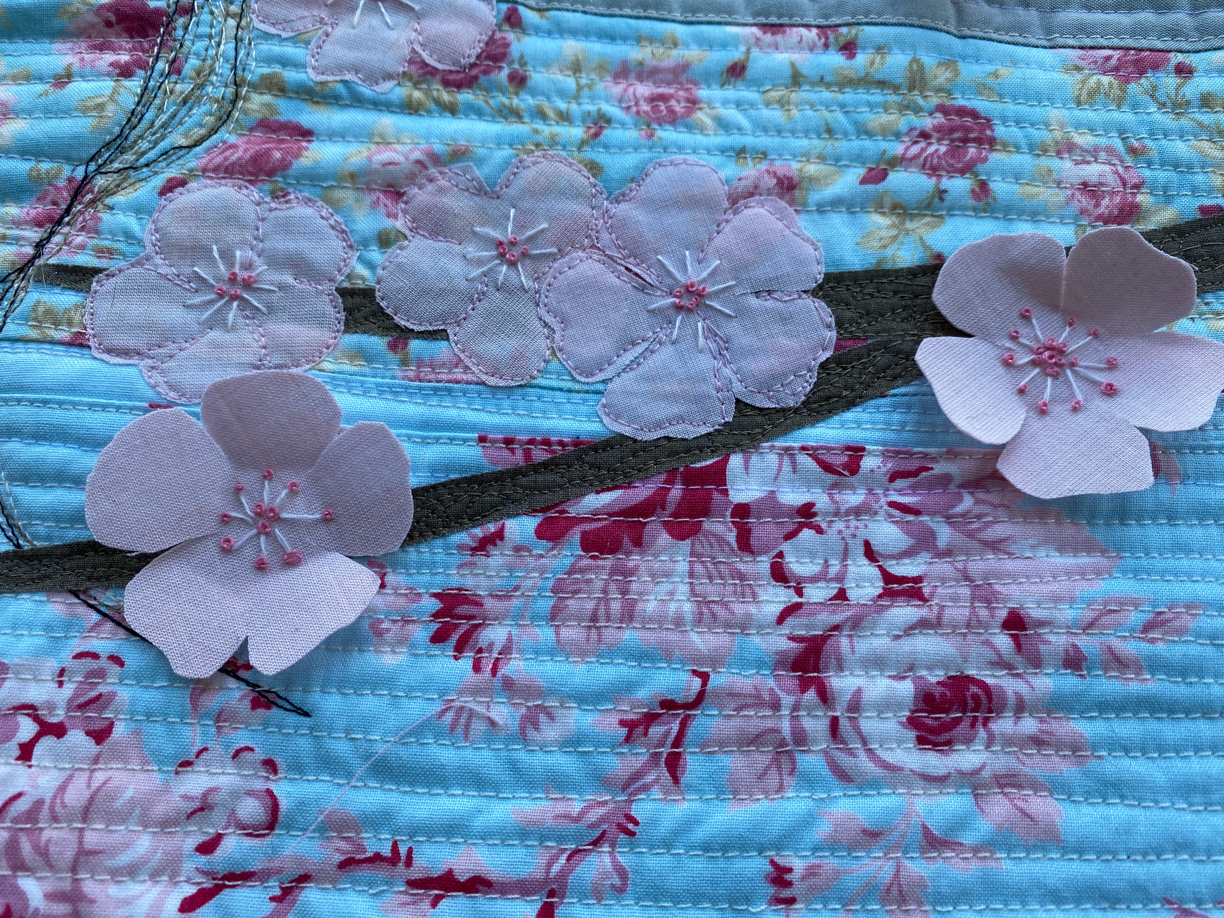
So when the Gouldian finches came into my mind, I realized they included all of the colors of the color wheel, and I endeavored to make a little "mixed flight" quilt of the birds in our flight. 

To do this, I first created a composite of all three birds, and then traced out a transparency to use for creating applique pieces. The individual birds were first constructed on a pressing sheet.


When each bird was complete, I peeled it off the pressing sheet and fused them to a background. Also, I had to bring their individual perches together on a single branch. It was hard selecting a background piece that wouldn't be too busy to show off their colors.


From there I added two borders...


and my quilt top was complete.


Each bird was given a little seed bead "eye spot," which brings more life to the eyes. Their beaks were shaded with crayon.


The edges of the applique were stitched down with invisible thread. I do this after adding the batting, but before adding the quilt back. The stitching holds the batting in place, and then I do more quilting after the back is added.


I quilted a sort of leafy meander in the background.


More leafy motifs were added in the two borders.


From there, it was ready for binding, and my quilt was complete. I call this quilt "Flights of Fancy." It ends up at 24 x 28 inches.


Here's how it looks from the back:


I had great fun making this quilt, and the trip down memory lane was well worth it. Our sons were young when our birds were raising their chicks, and so it was a fun process to witness along with our boys. I hope you like my quilt! I'm looking forward to see what the rest of you came up with. 

Leonardo Goes to Largs on May 1st


This quarter's challenge was to make a quilt illustrating Color Theory.

I am fascinated with the Fibonacci sequence of numbers. It is one of the most famous formulas in mathematics. Each number in the sequence is the sum of the two numbers that precede it. So, the sequence goes: 0, 1, 1, 2, 3, 5, 8, 13, 21, 34, and so on. 

It's been called "nature's secret code," and "nature's universal rule." It is said to govern the dimensions of everything from the the whorl of a seashell, to the Great Pyramid of Giza. Leonardo of Pisa -aka Leonardo Fibonacci- lived in the 1100s, but since it is found in nature, the sequence, obviously, predates him. (Maybe I should have entitled this Adam and Eve Go to Largs!) 

Being also fascinated by the Largs, Scotland waterfront, I decided to do another quilt featuring it. But how to include this quarter's theme "Color Theory?" I googled "Fibonacci and Color Theory" and found, to my delight, several articles citing the illustrious poet, scientist, and amateur artist, Johann Wolfgang von Goethe! 

Goethe, and Fritz Faiss after him, developed a method of selecting colors from a twenty-four-color wheel that is said to produce a pleasing palette every time. So I decided to give it a whirl. The twenty-four colors of the 24 space color wheel are as follows:

  1. Cadmium Yellow Light
  2. Cadmium Yellow Medium
  3. Cadmium Yellow Deep
  4. Cadmium Orange
  5. Cadmium Red Light
  6. Cadmium Red Medium
  7. Cadmium Red Deep
  8. Alizarin Crimson Golden
  9. Rose Madder
  10. Thalo Violet
  11. Cobalt Violet
  12. Ultramarine Violet
  13. Ultramarine Blue
  14. Cobalt Blue
  15. Prussian Blue
  16. Thalo Blue
  17. Thalo Blue + Thalo Green
  18. Thalo Green + Thalo Blue
  19. Thalo Green
  20. Viridian
  21. Emerald Green
  22. Permanent Green
  23. Permanent Green Light
  24. Permanent Green Light + Cadmium Yellow Light 

For this quilt I arbitrarily chose the first color the wheel/list to be the first position: Cadmium Yellow Light. I then selected numbers 2, 3, 5, 8, 13, and 21. These are the house colors.

(If I had chosen, for example, Thalo Blue -#16 in the list- for the number one wheel position, the next six color positions would have been 17, 18, 20, 23, 4, and 12. Remember, it's a wheel, so, 1 comes after 24.)


It is worth noting that I would not have chosen to use these particular colors if not for this exercise in Color Theory, and the promise that they would be pleasing together. As it turns out, my favorite part of the quilt is the sun. And the water is not bad, either. Hummm.... You may also notice that, in the first photo, the browns of the wharf are in the reverse Fibonacci sequence of 5, 3, 2, and 1 block(s) from left to right. And there you have it: Leonardo Goes to Largs on May 1st.


And now for something completely different! Have you heard the joke that starts, "Goethe, Fibonacci, and Becca walk into a bar?" No? Just as well. 


Colour Theory - All in the Mind


 Hello! I decided that, for this quilt, instead of documenting qualities of colours in the external world, I would use some conventional ways of illustrating colour theory to show the colours that letters, numbers and words display in my mind. I was inspired to make this quilt by a lovely book called Werner's Nomenclature of Colours', which was kindly gifted to me by Catherine. You can read more about the rationale behind this quilt and about how I made it over at Rainbow Hare. I'm very much looking forward to seeing what everyone has made for this reveal :)

Colour Theory: The Spirit of Summer

The theme for this quarter's piece was Colour Theory, and what a massive and complicated subject that is!  

Essentially it's about describing and explaining relationships between colours and why we find some satisfying.  As quilt makers most of us have probably come across the 'Colour Wheel' at some point - we often use it as reference when considering which colours might go well together. The particular wheel we are familiar with - the subtractive colour wheel, which is based on mixing pigments, and uses the primary colours red, yellow and blue - only represents one way of describing the relationships between different colours.  There are other models which depend, for example, on whether you are considering the properties of light - the additive colour wheel - or the physiology of the human eye.   

As I was feeling my way round the enormity of the subject, and at a bit at a loss, I thought about making an abstract quilt using complementary colours.  However I couldn't get away from a picture in my head of pink blossom against sunny blue skies and I really wanted to make that quilt even before I'd considered what the relationship between the colours was. 

The Spirit of Summer


For me, this is a really exciting combination of colours.  If you look at my blog you will see another quilt in my header which uses it.  


Using the quilters' subtractive colour wheel, red, of which pink is a tint, and this green-blue are split complementary colours (Interesting that unlike most tints, pink is significant enough to have its own name, instead of being 'pale red'.)  Green is red's complement, the colour with the highest contrast - and blue-green is an analogous colour to blue, which makes it part of a split complementary colour scheme with red.   

Using the additive colour wheel, the blue here is close to Cyan, which is directly opposite red, and is its complement.   If we think about how the human eye works, red and cyan stimulate different photoreceptors and together they are visually exciting.

So this quilt doesn't address the theme of Colour Theory head on but it illustrates two colours which have a particularly strong relationship with each other.   We don't have to know why we find a particular colour combination appealing [edited to add and Ruth's post made me realise that the emotional and thematic effect of these two colours is what is important to me] but Colour Theory can help us to explain and describe colour relationships we like and to put other combinations together. 


Colour Theory: The Four Seasons

I am obsessed with colour.  Not much trumps a beautiful colour palette for me.  That might be one of the reasons I stuck with quilting after making my first quilt.  I remember saying to my mum that I didn't think quilting was for me.  Imagine that! 

That was in 2012 and I was at that stage where, I didn't know what to put with what and was afraid to cut into my first fat quarter bundle, I had bought on Ebay.  My mum told me not to be daft, trust my instincts and get on with it!  Before she retired mum was a manager of a specialty food shop and dressed the windows.  She was very proud of her skill and woe betide anyone who touched her display of chocolate boxes or cheese selections!

She was right.  We all have a unique way of seeing the world and what looks green to me looks blue to you. So I started getting into colour theory and made a bunch of colour wheel quilts, rainbow quilts, squares inspired by Josef Albers, high contrast, contrast, analgous...you get the idea.

So when colour theory came up I was really excited and then really stumped!  I didn't fancy repeating something I had already done and was lost at what to play with next. 

Inspiration hit last month when the many birthdays that happen in March and April (think its something to do with the summer holidays!) led to many purchases, one of which was Rachel Hauser's book "The Quilter's Field Guide to Color".  I bought it for a quilty friend as I had taken Rachel's Color Intensive course many years ago and loved it.  Rachel's take on colour starts with the colour wheel but goes in the direction of colour emotion and themes.  One of those is the 4 Seasons.  

I thought I could explore that a bit in this challenge as I had focused on Winter and the word Frosty to select fabrics for this quilt design, also by Rachel Hauser, called the Penny Sampler.  The idea was low volume frosty fabrics but warmed up by the colours of a coal fire (don't ask me where the green came from - its seafoam by Kona and just seemed to work nicely with the other fabrics).

So having done winter I thought something with the other 3 seasons as well could be fun.  I also had a photo frame that was idly creating a tripping hazard in the hall, that I thought I could repurpose (it had been right by a window and the lovely watercolours I had bought in Paris had faded badly).  

I had a plan of sorts but this turned out a lot harder than I thought it would be.  I limited myself to 4 colours: Green for the grass,  Blue for the Sky, Yellow for the sun and Pink for the flowers that bloom at each season.

Summer and Autumn were tough.  I don't think I quite nailed them but there is enough difference between the other seasons to go with it. Summer being vibrant, saturated colours - nature explodes in colour and Autumn the same but fading, hints of gold and fading light.

So fabric selected what to do with it?  I first thought of circles, then squares.

I didn't think this would work with the prints I had so went with this in the end:

In fabric it looked like this:

 
Biggest blue sky and more green in Summer and way less in Winter.  Sun is low on the horizon in Winter and very pale.  Baby Pink in Spring when growth is new, hottest in Summer, Fading in Autumn and back with a bang in Winter for the holiday celebrations; think Holly or Poinsettias.
 
I added in very simple free motion quilting to hint at the seasons.  A daffodil for Spring, Daisies for Summer, a Leaf for Autumn and a snowdrop for Winter.
 

 Then popped them in the frame and up on the wall.
 

For some reason I put them in in reverse order but I like it like this and it brightens up the room so I'm keeping it this way.  This was a challenge and working from stash to pull 4 colours, same but different, was tough.  Not sure its 100% successful but I feel like I learned something more about colour in the process and am very glad to have had the opportunity to give it a try.

Color Theory: Page Turner


Page Turner
14" x 21"

When I was in junior college, as they called it way back then, we had an assignment to do something with colored paper. I wish I had kept my project because it looked something like this quilt. That project is what gave me the idea for this one. Instead of straight lines for the pages, I curved them to look more like pages turning. 

to enhance the effect of pages turning, I colored some of the edges with colored pencils. It is a very subtle effect.

And to hide the center line, that did not exactly match, I made a book mark with ribbon and beads.

Since this challenge is about color theory, I chose to show complimentary colors (orange and blue) with tints of those colors.


Just to be obnoxious: I also made this quilt a couple months ago, quilted it in March. It is also complimentary colors (turquoise and red-orange.). It is paper pieced on a triangle log cabin pattern that I drew from pictures of similar quilts. Quilting is all feathered in a matching thread.
Bird of Paradise
26 1/2 " x 26 1/2"